Same quality – more modern look
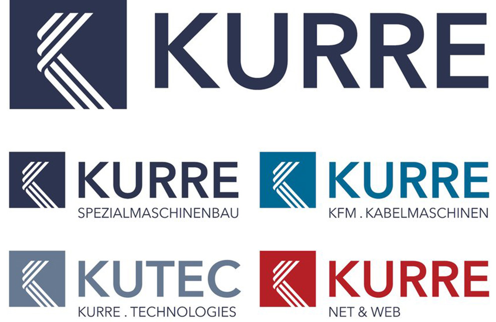
With immediate effect, the KURRE Group has a new, more modern corporate design. The changed appearance underlines the company’s objective. “We also want to show our innovative strength to the outside world,” says Stefan Plaggenborg.
The central element of the brand identity remains a stylized K. This K, with a wire and cable association, is part of an eye-catching square, followed by the name KURRE. The company remains true to the blue color scheme, albeit in different variations depending on the specialization. Only KURRE Net & Web is assigned the color red.
The timing is perfect for the upcoming Wire & Tube trade fair in Düsseldorf in April. The complete new corporate identity will be presented to the public at the joint stand with SIEBE Engineering.


